
Founding the UX Design practice and processes in fintech / SaaS
01 Summary
I joined DOOTAX, a tax automation SaaS platform, as a content specialist. I noticed the product lacked UX, proposed creating the area to the three founders, and became responsible for it.
I defined the design metrics and processes, hired and coordinated a junior designer, and redesigned the onboarding, which used to be a 2-hour live session. In 6 months, the NPS went from 37 to 69.
02 Context
DOOTAX is a tax automation SaaS platform with around 60 people, about 25 of them in product and engineering. The company and the product were growing fast. The system had been built entirely by back-end developers, with no professional looking at the experience, and usability was not a priority.
Users asked for more attention to experience and detail, and the product and engineering team, besides its normal demand, had to adapt the system to tax changes.
03 The challenge
Create the User Experience area from scratch in a growing company, with low design maturity, a technical team with a full agenda and no experience metric being measured.
04 My role and scope
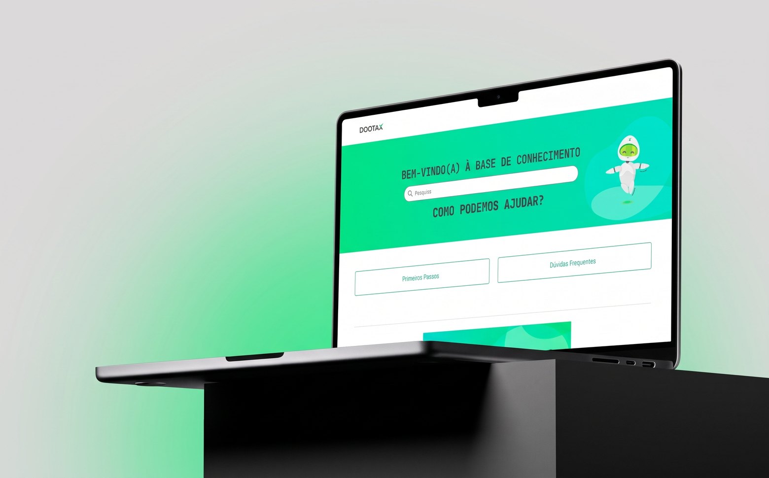
I joined the company as a content specialist. I handled the manuals, trainings, the system’s knowledge base on Zendesk, training videos and tutorials, release notes and two newsletters, one internal and one for customers.
It was from that position that I saw the lack of UX. I put together a pitch with the experience improvement points, the fronts of attack, the metrics we needed to track and the importance of UX for the product. I presented it to the three founders, who approved it, and I became responsible for the area.
I went through three teams, always in direct contact with the founders:
- Product: I reported to the CPO.
- Marketing: I reported to the Marketing director and helped structure the institutional website and landing pages.
- Sales: I reported to the CEO and worked in partnership with the CX team. This is when I hired a Junior UX Designer.
It was my first leadership experience. I led by influence, having created the area. I split the work with the designer: he took the more operational part, and I the strategic one, in contact with the CEO and the CX team.
05 Process
Structuring the area
Metrics. The company did not measure any experience indicator. I started with four basic metrics, to understand where the priorities were and have a base to measure other things later: NPS, CSAT, CES and SUS. The first NPS, with 416 responses, was 37. In this case I show the NPS.
Research. I ran a study to define the personas of the system’s users and the personas of the customers, who were different people. The product and engineering team assumed users were older people, used to traditional tax and accounting systems. The research showed the opposite: most were young, with a finished or ongoing degree, and more comfortable with technology. This result helped me defend design decisions with data. I also ran usability tests on Maze with some users.
Design process. I included design in the development process and in QA.
Follow-up. Every week I met with the CEO to show results and go through the projects. Once a month, in the company-wide hands-on, I presented what UX was delivering.
Fronts of work
- Onboarding. The first front, for its impact on the handoff between sales, onboarding and product. Details are in Solution.
- Styleguide. I restructured the styleguide together with a front-end developer, to follow the new visual identity defined by Marketing.
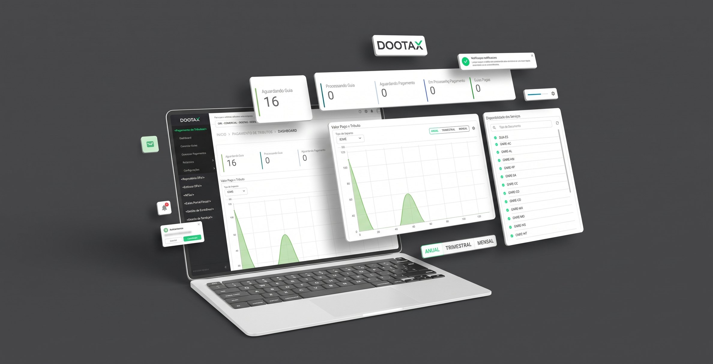
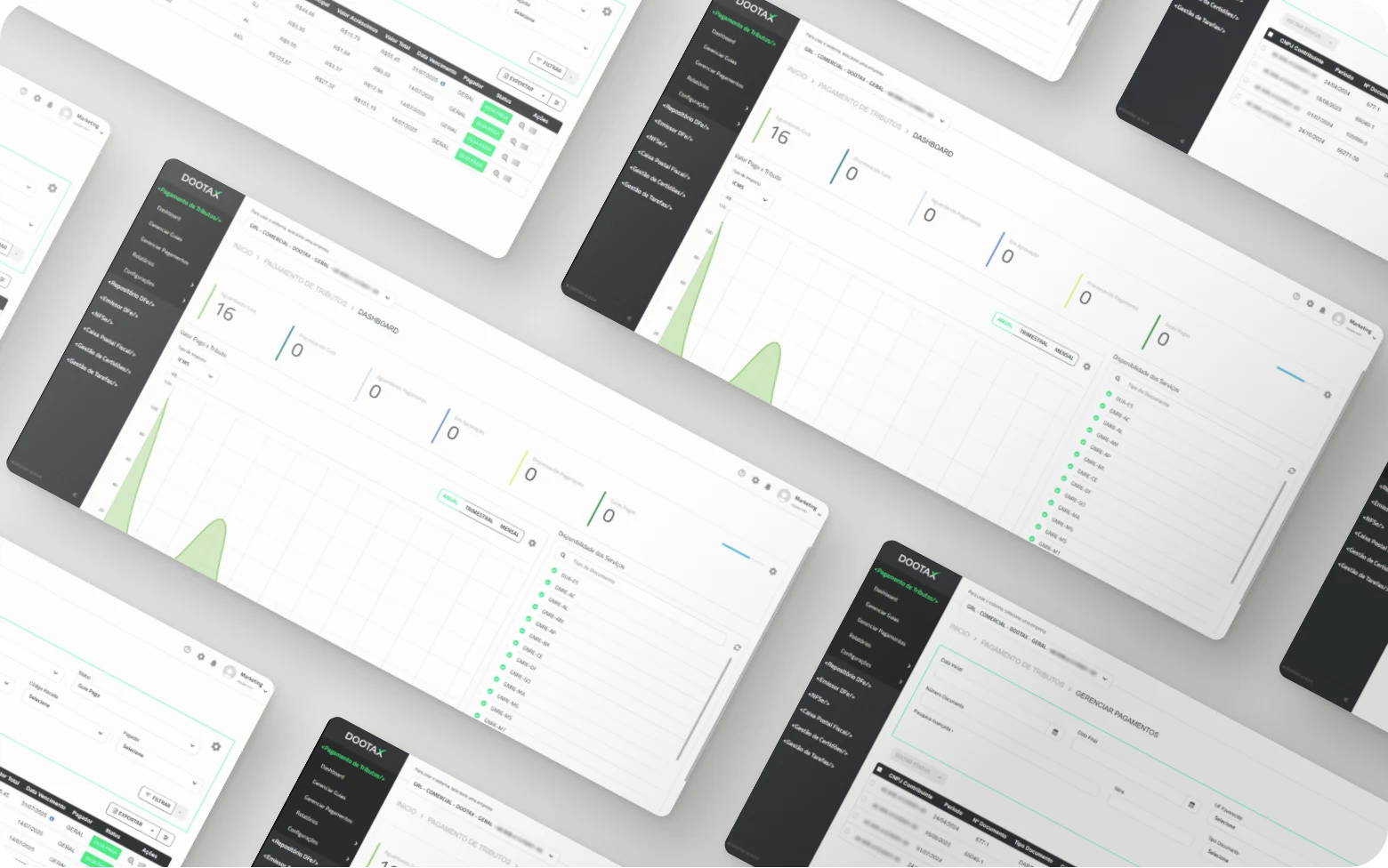
- Specific screens. I redesigned the dashboard, the system’s home screen, which had charts that communicated nothing, improving the information shown and the main chart. I also redesigned the settings screen and two new modules, with tables and an inbox.
- Marketing. I supported the landing pages and the institutional website.
What made the project hard
- Low UX maturity. The product and engineering team was more traditional and attached to the old solutions, and there was resistance to changing the process and the screens. The technical demand, largely because of tax changes, also limited how many of the screen improvements we could put into practice.
- My experience. It was the first time I structured a UX area and led. There was no senior design mentorship inside the company, so I turned to usability tests, persona research, mentoring and conversations with designers from other companies.
06 Solution
Onboarding required scheduling a time with a specialist, who spent around 2 hours showing the system and setting up the environment together with the customer. Many of these steps could be automated. The format tired the customer, overloaded the onboarding team and delayed setup, which delayed the handoff to product and support.
I replaced the session with a journey of interactive tutorials, in-product tours, recorded trainings and video materials, and automatic guidance emails. In HubSpot, I created email flows and enriched the CRM with information that lets the teams move each project forward without having to contact the customer all the time. The 2-hour session ceased to exist.
The handoff time to the product team dropped around 50% (my estimate). Specialists gained more time for strategic work, and the process became more scalable.
07 Results
| Moment | NPS |
|---|---|
| Start (416 responses) | 37 |
| After 4 months | 57 |
| After 6 months | 69 |
NPS was measured with the same tool and the same methodology in all three measurements. In the period, a new module was also launched, used by few customers. The result reflects the set of changes in the period, and I did not isolate the effect of each front.
Besides NPS, the handoff time to the product team dropped around 50% (estimate). CSAT, CES and SUS were also measured.
08 Learnings
If I redid this work today, I would structure the processes better together with the product and engineering team. I would cultivate, from the beginning, the relationship with the leaders of those areas and design from scratch a process that included design from the start of the demands, before proposing screen improvements. Today I have more maturity to keep that dialogue and defend design and its decisions.
The persona research was what helped me argue the most. Data about who really used the system changed the conversation with the product and engineering team.